Understand what matters to the user
Lloyds Banking Group (LBG) has a vast array of enterprise applications. The challenge set to me was to design an app that was scalable and removed the need for employees accessing multiple systems to complete one process.
Instead of trying to boil the ocean, I decided to focus my attention on two processes that would add the most value to the largest set of user groups.
These were the employee on-boarding process which involved using three separate applications. Then also the spend request form which was currently being served by a complicated excel spreadsheet.
For this project I was Lead Designer
Ideas to find opportunities that meet what matters to the user
I worked with the Product Manager and Product Owners defining the product and success metrics. I wrote the stakeholder discussion guides and conducted the interviews.
I also conducted some guerilla research over several days observing resource managers completing the onboarding process at various stages. This proved invaluable in helping me identify a lot of wasted effort and how we could improve the current process.
I then conducted some user interviews with the cost management team to deeply understand an unpick the excel spreadsheet currently serving spend request forms.
Once the investigation was complete, I was able to create research-driven design principles, user personas, user stories and use case/user flows.
The principles were:
- Simplify Colleagues processes.
- Improve user experience to drive behavioural changes.
- Consolidate disparate systems into a single consistent data layer.
- Remove jargon (Natural Language).
Design and develop a solution through test and learn
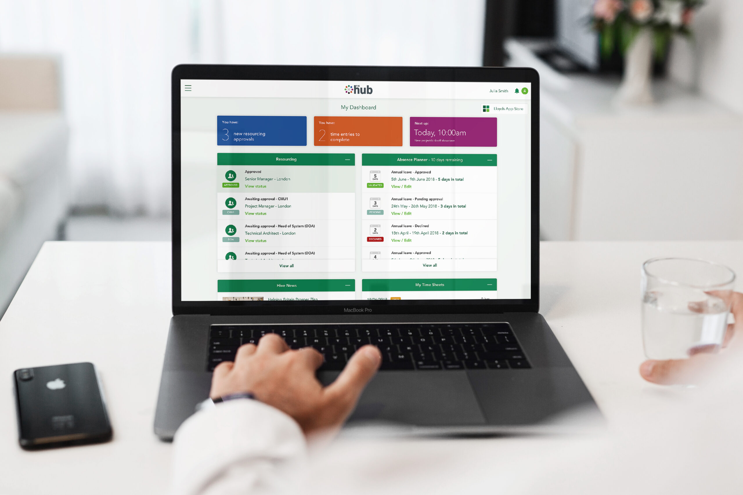
Next, I created low and then high fidelity wireframes, which enabled me to create the relevant prototypes. I created the on-boarding form for the spend request form using Axure. I then created application hub page UI this acted a central location for people to track requests.
Once the designs were complete, I created a discussion guide to lead me to the insights I wanted to learn and would help ensure that the research sessions were productive.
The structure for the qualitative research was seven sessions each lasting 45mins to an hour. It was followed by another seven sessions a week later to allow for design iteration. I then repeated this for cost managers.
The first session was a great success, and we were able to observe all user groups successfully using the new, improved applications. The resource managers were all thrilled with the new streamlined application. The new form meant that they could do everything from one application and be able to track requests at any stage of the process, which was previously not possible.
The cost managers sessions were also victorious; they benefited from a new and improved form which removed duplication of information in a new simplified UI.
We did also observe several further improvements that needed fixing before the second round of testing. I implemented these and arranged the next round of usability testing.
After the second round of testing, we happy that the applications were ready for development.
- Efficient and logical interfaces, leveraging API's, promoting better speed, cadence and accuracy of information.
- Visible and intelligent workflow.
- Consolidating disparate systems into a single consistent UI and data layer.
- Hugely improved employee onboarding experience.


