This case study delves into the journey of Amazon's pursuit to enhance the upper funnel conversion rates for its Insurance Store. It explores the challenges faced by the platform, the strategies I employed to address them, and the outcomes achieved through data-driven decision-making and innovative customer engagement techniques.
The issues at hand revolve around two core facets of upper funnel conversion:
- Awareness: Many potential customers are unaware of Amazon's insurance offerings. This lack of awareness results in missed opportunities for the platform to engage and educate prospective customers about the value and benefits of these services.
- Consideration: Even when customers are aware of the insurance products, a significant number of them fail to progress further down the sales funnel, suggesting that the consideration phase may have some barriers or friction points.
To tackle these issues, I embarked on a comprehensive project aimed at improving awareness and consideration within the upper funnel. This endeavour drew upon a multi-faceted approach that included data analytics and user experience enhancements.
In the subsequent sections of this case study, I will delve deeper into the project's key milestones, the methodologies adopted, the challenges encountered, and, most importantly, the positive impact it had on the upper funnel conversion rates.
- Product Designer
- User Research
- Interaction Design
- Visual design
- Prototyping & Testing
We built it, but they didn't come. The following is an investigation in the potential causes of the situation.
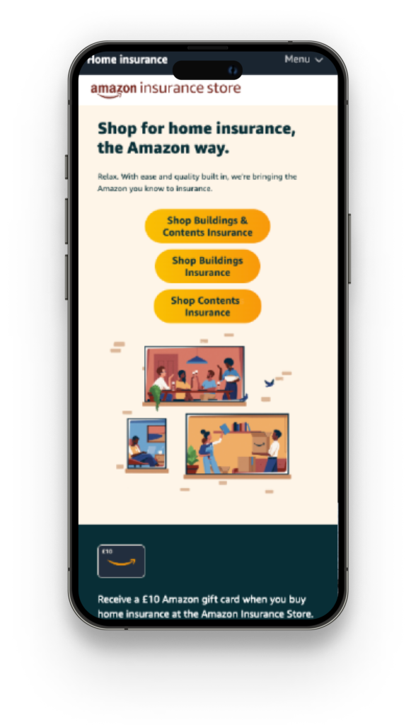
In the ever-evolving landscape of e-commerce, the Amazon Insurance Store stood as a pioneering venture at the crossroads of retail and financial services. With a vision to revolutionise the insurance industry, we set out to provide customers with a seamless, one-stop shopping experience for all their insurance needs. However, despite our lofty goals and the vast potential of our platform, a daunting statistic cast a shadow of concern over our efforts – a staggering 95% abandonment rate from the landing page.
- Lack of Clarity in CTA Labels:
- Hypothesis: Customers might have been confused due to the lack of clarity in the labels of the CTA buttons.
- Explanation: If the CTA buttons were labeled with insurance specific terms "Shop buildings and contents insurance" "Shop buildings insurance" and "Shop contents insurance," customers might not have a clear understanding of what Insurance each button represents. The ambiguity in labeling can lead to confusion straight from the get go.
- Overwhelming Choices:
- Hypothesis: Having three CTA buttons may have overwhelmed customers with choices.
- Explanation: When presented with multiple CTA buttons, customers might find it challenging to decide which one to click, especially if they are not well-differentiated or if they all appear equally important. This choice overload can lead to confusion and indecision.
- Market and competitive review
- Quantitative data validation
- Quantitative validation data Analysis
- Competitive review
The key areas I needed to validate were:
- Hypothesis 1 - Customers we confused by the 3 CTA's on the land page
- Hypothesis 2 - We lack a deal-seeking value proposition for customers to want to shop on the Insurance Store
Subsequent discussions with the product managers and the tech team yielded a profound revelation. The perplexing presence of three Call to Actions (CTAs) on the landing page was traced back to a deliberate architectural choice. The insurance questionnaire had been meticulously tailored to cater to the distinct requirements of each insurance category, which presented an intricate problem - the inability to provide a unified point of entry from the landing page.
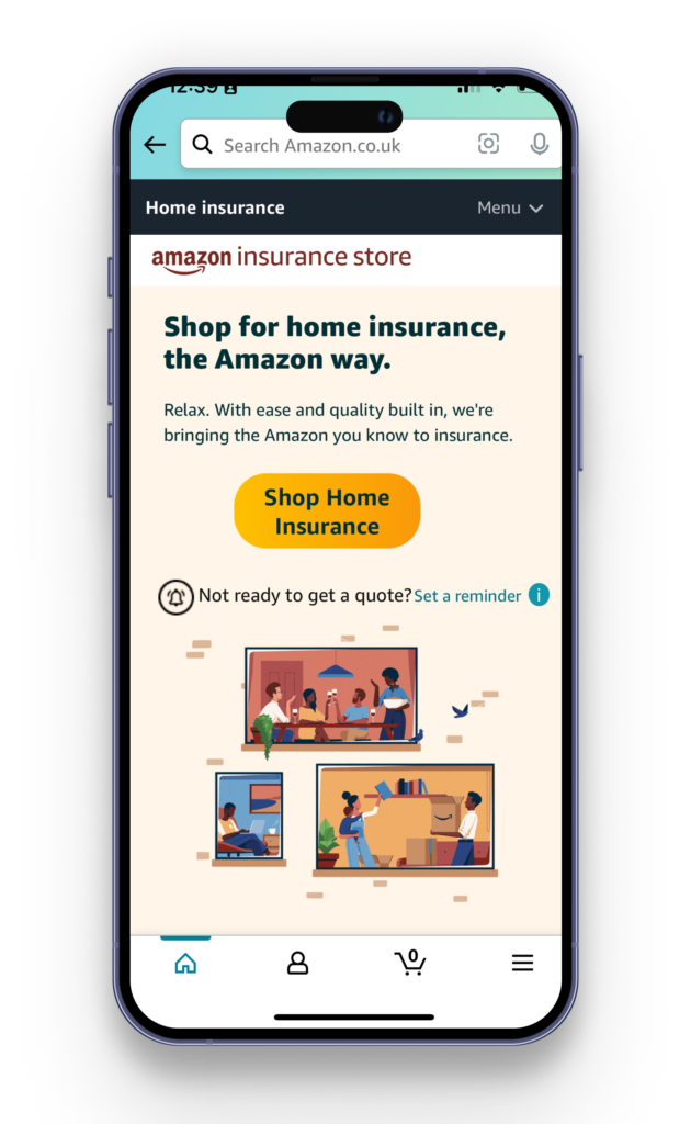
Although the discovery was disappointing, I removed hypothesis 2 from the equation for now since the data pointed to the users not scrolling to discover the proposition fully.
In pursuit of a streamlined user experience, strategic adjustments were made to the landing page layout. Specifically, product selection options were tactically relocated, enhancing informative engagement and cognisance capacity. This relocation was carried out considering the architectural complexities inherent in the questionnaire development, ensuring a seamless integration of user education. This strategic move allowed me to move to single CTA on the landing page.
Additionally, my analysis revealed a noteworthy source of friction and attrition on the insurance eligibility page. This page, following an in-depth evaluation of the top 5 Price Comparison Websites (PCWs) within the competitive landscape, was traditionally positioned at the end of the questionnaire. Armed with this knowledge I worked with the PM's to add these questions at the end section which avoided any additional pages needing to be developed.
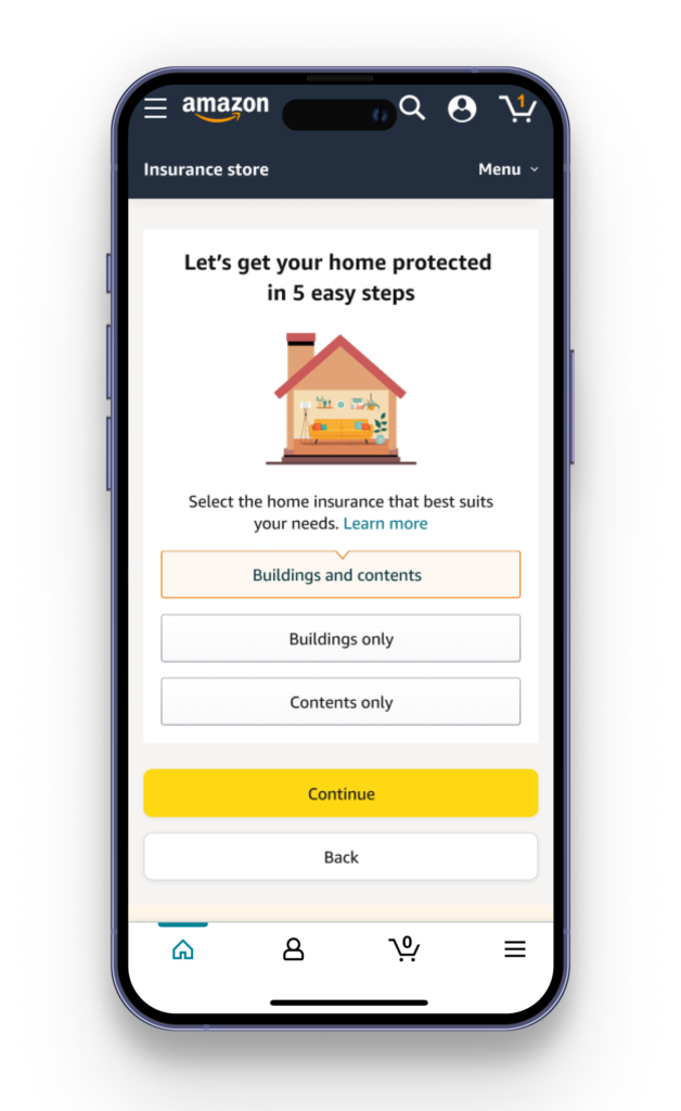
Subsequently, I turned my attention to optimising the product selection page, focusing on alleviating cognitive load and streamlining the textual content. Employing a visual design strategy, I crafted an illustrative representation that effectively outlined the various home insurance product categories. This visual aid was instrumental in simplifying the decision-making process, enhancing user comprehension, and reducing cognitive burden.
To further improve the user-friendly nature of the interface, each illustration was accompanied by a selection button, providing an intuitive means of choice. Furthermore, I incorporated a proactive accessibility feature for customers who may still require additional information or those with visual impairments. A "Learn More" link was introduced at the top of the page, featuring a bottom sheet interaction. This thoughtful addition enabled users to access comprehensive details on each type of insurance product, ensuring inclusivity and comprehensive understanding for all users.
Concluding the enhancement process, I implemented a strategic element to provide users with a clear sense of the time commitment required for completing the questionnaire. This was achieved by incorporating an informative and motivational introduction, briefly outlining the sequential steps users would need to follow. By doing so, I aimed to offer transparency, manage user expectations, and foster a more positive user experience by providing a comprehensive roadmap for their journey through the questionnaire.
Play with the design
A rigorous validation process was imperative to ascertain the tangible impact of the implemented changes. To achieve this, we embarked on an A/B or web lab experiment, which allowed us to not only gauge the efficacy of the modifications but also to ensure that they did not inadvertently exacerbate the situation. This experimental phase involved a comprehensive comparison between the newly introduced design and the pre-existing one, conducted over two weeks.
The post-experiment analysis yielded a noteworthy outcome, with a demonstrable 7.8 basis points per minute (7% increase) uptick in conversion rates. This result underscored the alterations' promising nature and potential to enhance user engagement and overall performance significantly.
However, it is essential to acknowledge that our work is far from concluded. There remains a subsequent phase of analysis aimed at validating hypothesis 2. This hypothesis revolves around the absence of a compelling value proposition to incentivise customers to engage with the Insurance Store. Anticipating that this undertaking will be a substantial endeavour, especially in light of the dynamic landscape wherein even industry giants like Amazon may opt for strategic shifts, we, as designers, must take on the mantle of leadership and help senior leadership make these bold decisions to address these challenges head-on.


