


To comply with my non-disclosure agreement, I have omitted and obfuscated confidential information. All information is my own and does not necessarily reflect the views of Lloyds Banking Group.
Understand what matters to the user
Lloyds Banking Group previously relied on a third-party supplier for its trading applications. However, the company made the strategic decision to develop an in-house trading application due to the escalating maintenance costs associated with even minor changes.
Despite my limited knowledge of trading applications and the trading process, I tackled the steep learning curve with determination. Leveraging my experience, I proficiently extracted essential information from subject matter experts through stakeholder interviews. This empowered me to craft a solution that precisely addressed the needs of both the business and end-users. As the Lead Designer, I confidently embraced the challenge of designing a trading application that replicated existing functionality, elevated usability, and modernised the user interface.
Helps us understand, rather than simply assume, what the problem is. It involves speaking to and spending time with people who are affected by the issues.
In my role as a UX researcher and designer for this trading platform project, I collaborated extensively with the Product Manager to define the product's scope, constraints, and success metrics. This close partnership was crucial in aligning our vision and ensuring that our research and design efforts were tightly focused on delivering tangible value to our stakeholders.
Working with traders presented unique challenges due to the nature of their profession. Time is a precious commodity in the trading world, with every second potentially impacting financial outcomes. This reality required me to adopt a highly pragmatic and efficient approach to my research methodology.
I meticulously crafted user interview scripts to maximise the value of our limited time with traders. These scripts were designed to extract essential information quickly and effectively, focusing on key pain points, workflow bottlenecks, and opportunities for improvement. I employed a mix of targeted closed-ended questions for quantifiable data and strategically placed open-ended questions to uncover deeper insights and unexpected user needs.
In addition to trader interviews, I conducted guerrilla research over several days, observing back-office staff as they processed trading transaction information. This ethnographic approach provided invaluable insights into the day-to-day operations and revealed numerous instances of wasted effort and duplicated processes. I documented these observations meticulously, noting specific tasks, time spent, and potential areas for optimisation.
The combination of structured interviews and observational research allowed me to comprehensively understand the front-end trading experience and the back-end support processes. This holistic view was instrumental in identifying opportunities for improvement across the entire trading ecosystem.
The insight gathered from the discovery phase can help you to define the challenge differently.
Upon completing the research phase, I synthesised the collected data to create a suite of research-driven deliverables:
- Design Principles: These guiding tenets served as a north star for our design decisions, ensuring that every feature and interaction aligned with our core objectives. The principles were:
Anticipate the future with trustworthy insights
Provide value by automating existing manual processes
Enable decisions much faster than humans about increasingly complex situations
Define behaviour limits to reduce risk and prevent damage - User Personas: I developed detailed personas representing our key user groups, traders and back-office staff. Each persona included demographic information, goals, pain points, and critical behaviours, helping the team empathise with our diverse user base.
- User Stories: I crafted a comprehensive set of user stories based on our research findings. These concise narratives described specific user needs and desired outcomes, providing a clear direction for feature development and prioritisation.
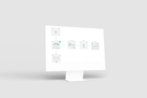
- Use Cases and User Flows: I mapped out detailed use cases and user flows for critical trading scenarios. These visual representations illustrated users' step-by-step journey through the platform, highlighting decision points, potential friction areas, and opportunities for streamlining processes.
By grounding these deliverables in solid research, we ensured that our design decisions were based on real user needs and behaviours rather than assumptions. This approach improved the likelihood of creating a successful product and provided a strong foundation for justifying design choices to stakeholders.
Throughout the process, I maintained open lines of communication with the Product Manager and critical stakeholders, regularly presenting research findings and design concepts for feedback. This iterative approach allowed us to refine our understanding of user needs and adjust our design direction as necessary, ultimately leading to a more robust and user-centred trading platform.
Encourage people to give different answers to the clearly defined problem, seeking inspiration from elsewhere and co-designing with a range of different people.
Next, I embarked on creating low—and high-fidelity wireframes, a critical step in the design process. The low-fidelity wireframes allowed me to quickly sketch out basic layouts and functionalities, focusing on the overall structure and user flow without getting bogged down in visual details. This stage was crucial for rapid iteration and gathering initial feedback.
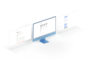
Following this, I developed high-fidelity wireframes, which provided a much more detailed and visually accurate representation of the final product. These wireframes encompassed many complex elements, from intricate trading blotters to sophisticated back-office input forms. The high-fidelity wireframes were the foundation for creating interactive prototypes, allowing stakeholders and potential users to get a tangible feel for the product before any actual development began.
Once the designs were finalised, I crafted a comprehensive discussion guide. This document was instrumental in structuring the upcoming research sessions, ensuring they would be productive and yield the specific insights we sought. The guide included carefully crafted questions and scenarios to uncover user preferences, pain points, and workflow patterns. Additionally, it addressed features the product manager had requested, which I suspected might be unnecessary. This provided an excellent opportunity to validate or challenge these assumptions through direct user feedback.
The qualitative research was structured into two rounds of seven sessions each, with each session lasting between 45 minutes to an hour. This design allowed for an initial round of testing followed by a week-long period for design iteration based on the first round's feedback. The second round then served to validate these iterations. The research participants were carefully selected to represent a cross-section of end-users, including traders and back-office staff. This diverse group ensured we could test the application across various use cases and scenarios, including typical workflows (happy paths) and error states (unhappy paths).
The first round of sessions proved to be highly successful. We observed all user groups effectively navigating and utilising the new, improved applications. The positive response from the traders, a group known for their high standards and critical feedback, was particularly noteworthy. Their enthusiasm for the new design was a significant win. Similarly, the back-office staff expressed great satisfaction with the streamlined processes, eliminating redundant data entry. This improvement increased efficiency and reduced the potential for errors, allowing them to complete tasks more quickly and accurately.
Despite the overall success, we also gathered valuable insights for further improvements. I identified several areas where the user experience could be enhanced through careful observation and user feedback. Importantly, I also confirmed that certain features the product owner requested were unnecessary, as users either didn't use them or needed clarification. This evidence-based approach allowed me to confidently recommend removing these features in the next iteration, streamlining the interface and reducing development costs.
Following the initial round, I implemented the suggested improvements and conducted a second round of user testing. This iteration was crucial to ensure the changes addressed the previously observed issues without introducing new problems. I was pleased that the tweaks were effective, and the refined design was ready to be handed to the development team for production.
In addition to the functional design, I produced detailed UI designs and a comprehensive style guide. This documentation meticulously outlined every feature and application asset for the UI Developer. The style guide covered typography, colour palettes, button styles, form elements, and other UI components, ensuring consistency across the application. Moreover, this documentation serves as the foundation for a design system that can be used for future iterations and expansions of the application, promoting coherence and efficiency in ongoing development.
I maintained open communication with stakeholders throughout this process, regularly presenting findings and gathering feedback. This collaborative approach ensured that the final product met user needs and aligned with business objectives and technical constraints.
A solution that delivers and measures customer value, business value and quality.
After finalising our designs, we initiated the crucial handover process to the developer feature team. This transition marked a significant milestone in our project, moving from conceptual design to practical implementation. I took a proactive approach in this phase, working closely and collaboratively with the development team to ensure a smooth transfer of knowledge and design intent.
During this period, I maintained constant communication with the developers, scheduling regular check-ins and design review sessions. These meetings served multiple purposes: they allowed me to clarify design decisions, explain the rationale behind specific user interface choices, and address any technical constraints or implementation challenges that arose. I also provided detailed annotations on our design files, outlining interactions, responsive behaviours, and edge cases to minimise ambiguity.
As questions and queries inevitably surfaced during the development process, I made myself readily available to the team. This open-door policy facilitated quick resolution of issues, preventing potential bottlenecks in the development timeline. I also participated in code reviews from a design perspective, ensuring that the implemented features accurately reflected the intended user experience.
Once we had a working codebase, I arranged comprehensive accessibility testing. This critical step aimed to evaluate the product's usability across a broad spectrum of accessibility needs. Our testing covered various aspects, including:
Visual impairments: Testing with screen readers, ensuring proper colour contrast, and verifying text scalability.
Motor impairments: Evaluating keyboard navigation and ensuring that interactive elements were easily targetable.
Cognitive impairments: Assessing the clarity of instructions, consistency of layout, and overall ease of use.
We engaged automated testing tools and manual testers with various accessibility needs for a holistic view of our product's accessibility. The insights gathered from these tests were then prioritised and incorporated into our development backlog.
I closely monitored the product's performance through targeted testing sessions as we approached the launch. These tests were designed to simulate real-world usage scenarios, allowing us to identify and address performance bottlenecks or usability issues. I worked with the team to prioritise features and optimisations aligned most closely with our users' primary intentions and needs. This user-centric approach ensured we delivered maximum value with our initial launch while setting the stage for future iterations.
Simultaneously, I initiated early collaboration with the LBG (Lloyds Banking Group) communications team. This partnership was crucial for several reasons:
- Naming: We worked together to develop a memorable product name that aligned with our brand and accurately reflected the product's purpose and value proposition.
- Framing: I provided the communications team in-depth information about the product's features, benefits, and target audience. This allowed them to craft messaging that effectively communicated the product's value to potential users and stakeholders.
- Release strategy: We collaborated on developing a comprehensive release plan, including timing, channels, and key messaging points. This involved creating a timeline for teasers, announcements, and post-launch communications.
- User education: I worked with the team to develop user guides, FAQs, and other educational materials to support a smooth onboarding process for new users.
- Stakeholder communication: We prepared presentations and reports for internal stakeholders, ensuring that all relevant parties within LBG were informed about the product's launch and its potential impact on the business.
This early and close collaboration with the communications team ensured that our product launch was a technical success and effectively positioned and communicated to our target audience. It allowed us to create a cohesive narrative around the product, from its conception to its release, enhancing its reception and adoption among users.
Throughout this final phase, I maintained a flexible approach, ready to make last-minute adjustments based on feedback or unforeseen challenges. This adaptability, combined with our thorough preparation and cross-functional collaboration, set the stage for a successful product launch.
Increased User Productivity: The new system design significantly boosted user productivity across various roles. We streamlined the trading blotter interface for traders, allowing for quicker execution of trades and more efficient management of positions. This was achieved through:
- Implementing customisable dashboards that allowed users to prioritise the most relevant information
- Creating intuitive shortcuts for everyday actions, reducing the number of clicks required for frequent task
- Introducing advanced filtering and sorting capabilities, enabling users to quickly find the data they needed
We redesigned input forms and workflows for back-office staff to minimise redundant data entry. This was accomplished by:
- Implementing auto-fill features that populated fields based on previously entered data
- Creating intelligent form validation that caught errors early in the process, reducing time spent on corrections
- Developing a more logical flow of information input, aligning with users' natural thought processes
We conducted time-motion studies before and after implementation, which showed an average reduction in task completion time of 27% across all user groups. This translated to approximately 2.5 hours saved per user per day, allowing staff to focus on more value-added activities.
Leveraged Existing APIs to Reduce User Input: We identified several opportunities to integrate existing internal and external APIs to automate data population and reduce manual input. This initiative involved:
- Connecting to market data APIs to automatically update pricing information in real-time
- Integrating with internal customer databases to pull relevant client information, reducing the need for manual entry and minimising errors
- Linking to regulatory reporting APIs to ensure compliance data was accurately and automatically captured
Leveraging these APIs reduced manual data entry by approximately 60%, saving time and significantly reducing the potential for human error. The system now automatically pulls and updates information from 12 different internal and external sources, ensuring data accuracy and timeliness.
Increased User Satisfaction: User satisfaction saw a marked improvement, as evidenced by both quantitative and qualitative feedback:
- User surveys showed a 92% satisfaction rate, up from 63% with the old system
- Qualitative feedback from interviews and focus groups consistently highlighted the system's intuitiveness and efficiency
Key factors contributing to increased satisfaction included:
- A more modern, clean interface design that reduced visual clutter and cognitive load
- Personalisation features that allowed users to tailor the interface to their specific needs and preferences
- Improved system responsiveness and speed, with page load times reduced by an average of 40%
- Better integration with other tools in the users' workflow, creating a more seamless experience
Significantly Reduced Support Costs for the Bank: The transition from a third-party-provided solution to an in-house system resulted in substantial cost savings:
- Direct cost savings: By eliminating the need for the third-party provider, we reduced annual licensing and support fees by approximately £2.5 million.
- Reduced internal support needs: The more intuitive design and improved user experience reduced support tickets related to system usage by 65%.
- Faster issue resolution: For issues that did arise, our in-house team was able to resolve them 3x faster on average than the previous third-party support.
- Streamlined training: The intuitive design reduced the need for extensive user training. We saw a 50% reduction in onboarding time for new users.
- Improved compliance: By having direct control over the system, we could more quickly and efficiently implement regulatory changes, reducing compliance-related risks and potential fines.
We conducted a comprehensive cost-benefit analysis showing that the new system would pay for its development costs within 18 months, primarily through eliminating third-party fees and reduced support costs. Over five years, the projected savings are estimated at £14 million, not including the value of increased productivity and reduced errors.
Furthermore, bringing the system in-house has given us greater flexibility to rapidly implement new features and respond to changing market conditions. This provides a strategic advantage over competitors relying on less flexible third-party solutions.
This combination of increased productivity, leveraged APIs, higher user satisfaction, and reduced costs has positioned the new system as a significant success from both a user and a business standpoint. It has set a new standard for internal tools within the organisation and has become a model for future development projects.